
Important indicators are flashing warning signs to investors that the stock market may be getting overvalued.
Last year, the S&P 500 (^GSPC +0.65%) gained 16% — marking the third straight year the index generated double-digit returns. While stocks have gotten off to a hot start to begin 2026, two important indicators suggest that a pullback could be on the horizon. Let’s dig into these important metrics to understand just how frothy the market has become. From there, we’ll determine where might be the best place to invest as stocks continue to roar, for now.

Image source: Getty Images.
The S&P 500 is overvalued compared to historical norms
According to FactSet Research, the S&P 500 currently boasts a forward price-to-earnings (P/E) multiple of 22. Not only is this elevated compared to the index’s five-year and 10-year forward P/E levels, it is historically high in general.
In recent history, the only other periods when the S&P 500 was trading at such a premium relative to forward earnings estimates were during the dot-com bubble, and during the stock market frenzy during the COVID-19 pandemic’s height (which was supported by abnormal levels of liquidity given the low-interest-rate environment).
When forward valuation multiples begin to rise sharply, it could be an indication that expectations are outpacing actual earnings growth. In other words, investors are pricing the market to perfection — a scenario featuring strong revenue growth, widening profit margins, and a steady macroeconomic picture across the board.
This is important to understand because even a good earnings report may end up disappointing investors if sentiment is not aligned with reality. Under these conditions, a sell-off could occur, as valuation, not business performance, was the culprit.
Another important metric to digest is the S&P 500 Shiller CAPE ratio. This measurement accounts for corporate earnings over a 10-year period — adjusted for inflation — in combination with the current level of the stock market. Essentially, the Shiller CAPE is a useful mechanism in gauging how expensive the market is relative to a normalized long-run earnings picture.
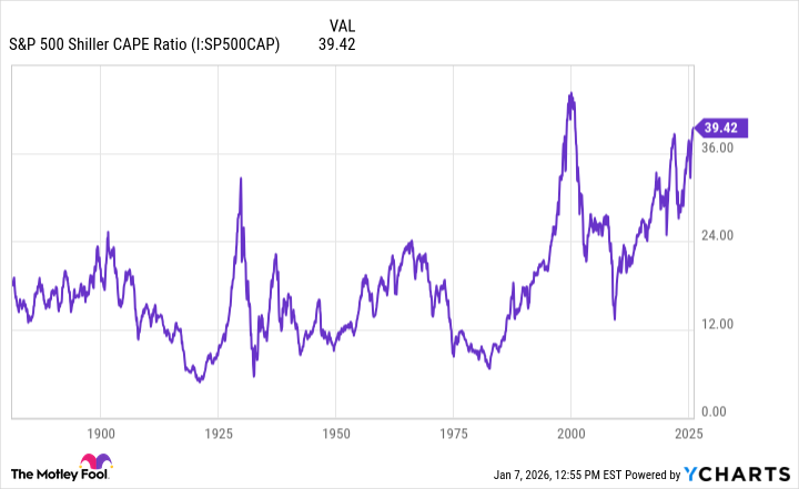
S&P 500 Shiller CAPE Ratio data by YCharts.
Right now, the CAPE ratio is hovering around a level of 39 — its highest point since the dot-com bubble burst in early 2000. Taking a longer-term view into perspective, investors can see that during times of peak CAPE ratios, lower stock returns often followed. This is especially clear in the late 1920s and early 2000s.
Will the stock market crash this year?
Given the details above, I think history would suggest that a correction could be in store for 2026. The bigger variable in my mind is how long such a sell-off could last. After all, the stock market is currently propped up by secular tailwinds fueling artificial intelligence (AI), energy, and infrastructure — a theme I don’t see changing anytime soon.

Today’s Change
(0.65%) $44.82
Current Price
$6966.28
Key Data Points
Day’s Range
$6917.64 – $6978.36
52wk Range
$4835.04 – $6978.36
Volume
3B
I think a more realistic scenario will be to see how earnings shake out compared to Wall Street’s expectations, as well as what actions we may see from the Federal Reserve and how these variables ultimately affect the broader macro environment.
Against this backdrop, I think smart investors could employ a dual strategy right now: Accumulating long-term positions in established, blue chip stocks with durable business models, and keeping an ample cash reserve. This type of approach can help bring a level of resilience to your portfolio that should insulate any potential losses from a precipitous sell-off in equities.
With this in mind, if the market does crash this year, it’s not necessarily a reason to hit the panic button or run for the hills. Should the market actually begin to show some weakness, long-run returns across the S&P 500 indicate that buying the dip has always proven profitable for patient investors.
