

Torsten Asmus/iStock via Getty Images
“Bull markets climb a wall of worry; bear markets slide down a river of hope.” – Wall Street adage
Strong market entry points are rarely found during moments of comfort or clarity. Instead, the most attractive buying opportunities are typically associated with periods of market stress. From there, equities tend to climb a “wall of worry,” advancing in the face of issues such as recessions, inflation spikes, geopolitical tensions, policy errors and lofty valuations.
This dynamic exists because what matters most for financial markets is if reality turns out better or worse than what has already been priced in. As a result, when expectations are low — as they are today — stocks can push higher if subsequent events turn out better than feared. From this perspective, skepticism is not a barrier to a bull market but rather part of its foundation. Doubts will eventually be assuaged and sentiment will improve, which should lead to hedges being unwound and cash moving off the sidelines.
At present, the biggest “bricks” in the wall of worry include stagflation, private credit risks, job losses due to artificial intelligence (AI) and market concentration. The first is directly related to oil prices. How long these stay higher appears to be the most significant worry for investors at present. While current conditions invite comparisons to the 1970s, the U.S. economy is structurally different today — with energy independence achieved and energy intensity lower — suggesting the transmission from higher oil prices into growth and inflation should be more muted than the past.
A good example of this can be found in direct spending on energy goods and services by U.S. consumers, which had fallen below 4% of consumption before the escalation of geopolitical tensions in the Middle East. This figure is nearly the lowest since World War II and well below the months heading into both the Iraq War in 2003 and the Gulf War in 1990.
Exhibit 1: Don’t Be So “Energy” Sensitive
Sources: U.S. Bureau of Economic Analysis (BEA), NBER, Macrobond. Data as of March 13, 2026, latest available as of March 31, 2026. Gray shading reflects recessionary periods.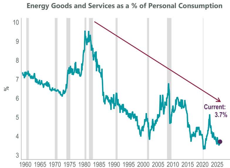
The most recent oil shock in 2022, sparked by the Russian invasion of Ukraine, did not drive a U.S. recession as the aforementioned structural changes were already in place. Additionally, the ClearBridge Recession Dashboard has shown itself to be an important barometer for the fate of the economy heading into shocks, with the green overall signal in February 2022 suggesting the U.S. could weather the storm. This has, in fact, been the case during seven of the eight most recent major energy spikes occurring amid an overall expansionary reading on the dashboard. Conversely, oil shocks that occurred when the dashboard was red — suggesting the economy was already vulnerable to a recession — have served as a catalyst or added fuel to an already burning economic fire.
Exhibit 2: Dashboard Determines Economy’s Fate
Note: Oil price is Arabian Gulf Arab Light prior to April 1993, and West Texas Intermediate from April 1993 – present. Oil “spikes” occurring in the aftermath of recessions are excluded. Data as of March 31, 2026. Oil price sources: Bloomberg, Federal Reserve Bank of St. Louis, Economic Research Division, NYMEX. Recession Dashboard Sources: BLS, Federal Reserve, Census Bureau, ISM, BEA, American Chemistry Council, American Trucking Association, Conference Board, Bloomberg, S&P, NBER. The ClearBridge Recession Dashboard was created in January 2016. References to the signals it would have sent in the years prior to January 2016 are based on how the underlying data was reflected in the component indicators at the time.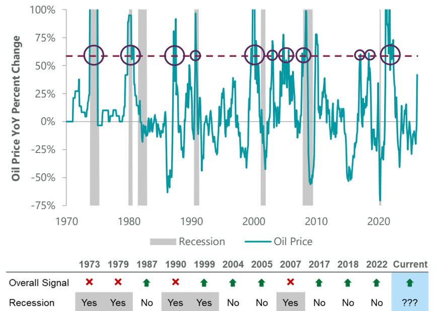
The dashboard’s continued overall green expansionary signal gives us additional comfort that, although sentiment is poor, underlying economic fundamentals are holding up. This should offer resilience to the current oil shock. There were no individual indicator changes for the dashboard this month, and we welcome the “return” of the Retail Sales indicator, which is no longer “on hold” after being disrupted by the government shutdowns and has maintained its pre-shutdown green reading. We are optimistic that Housing Permits data will “catch up” from shutdown disruptions next month given the current Census Bureau release schedule (Exhibit 3).
The combination of weak sentiment, a market selloff and resilient economic fundamentals suggests a buying opportunity for long-term investors. History shows that investors should consider taking advantage of this weakness, with solid returns in the S&P 500 Index following historical “geopolitical dips.” Specifically, U.S. equities have experienced positive returns on average over the 1-, 3-, and 6-month periods following past geopolitical flare-ups dating back to 1950. We note that some of the poorest returns in the track record have come during larger conflicts that escalated into major wars, but even there the record is mixed, with economic fundamentals tending to supersede geopolitical risks for equity markets such as during the recessions in 1973 and 1990 (Exhibit 4).
Exhibit 3: U.S. Recession Dashboard
‘Not Available’ reflects data that has not been updated due to the government shutdown. Data as of March 31, 2026. Sources: BLS, Federal Reserve, Census Bureau, ISM, BEA, American Chemistry Council, American Trucking Association, Conference Board, Bloomberg, CME Group, FactSet and Macrobond. The ClearBridge Recession Dashboard was created in January 2016. References to the signals it would have sent in the years prior to January 2016 are based on how the underlying data was reflected in the component indicators at the time.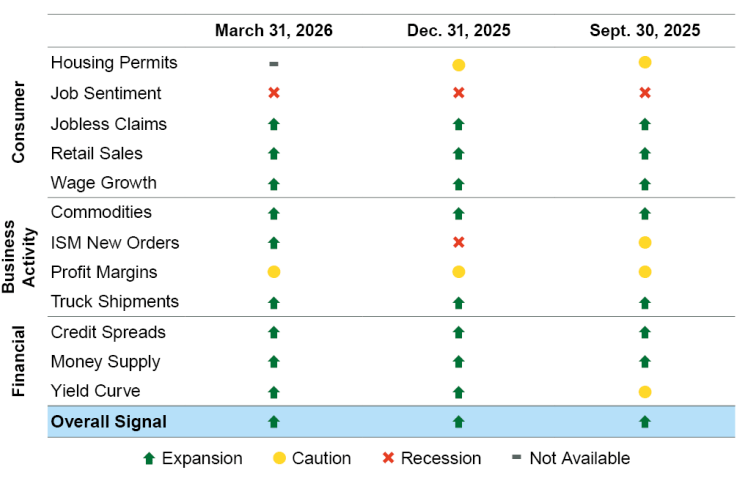
Exhibit 4: Buy the Geopolitical Dip?
Data as of March 31, 2026. Sources: FactSet, S&P.
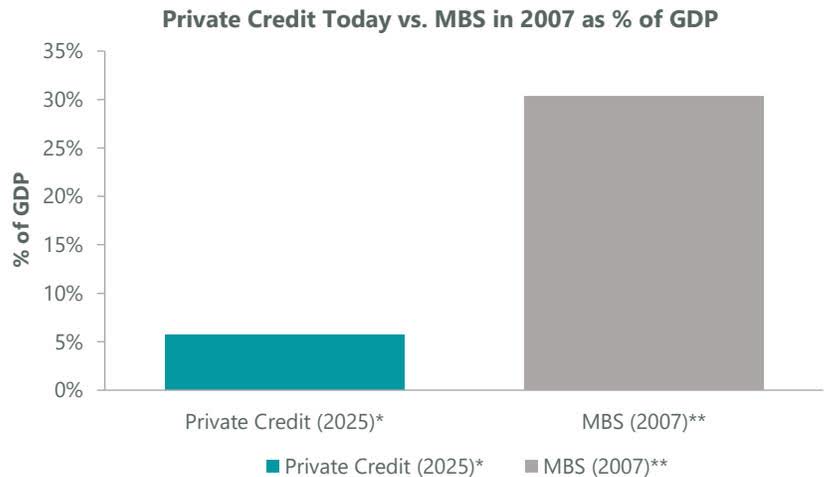
The second brick in the wall of worry has been private credit. The opaque nature of the asset class has led some to conclude that it is ripe to be the next shadow-banking accident. However, deeper analysis shows that while risks certainly exist, they are unlikely to generate substantial enough macroeconomic spillovers to cause a recession.
At its core, private credit uses long-term funding that is gated, which limits the risk of a problematic “run on the bank” dynamic where investors all look to exit at once. Use of leverage in the asset class is moderate, with IMF research suggesting that aggregate bank exposure to the industry amounts to $300 billion, or less than 2% of overall loan books. Although private credit has witnessed an uptick in defaults recently, its overall size amounts to a fraction of what mortgage-backed securities (MBS) were heading into the Global Financial Crisis (GFC). Private credit today is equivalent to 6% of GDP; MBS in 2007 was approximately 30%.
Exhibit 5: Private Credit in Perspective
The third brick in the wall of worry has been fear of an AI-induced layoff cycle or “job apocalypse.” This fear is understandable: if AI displaces workers faster than it creates new jobs, overall household income would fall, demand would weaken and corporate profits would deteriorate. Although February’s soft jobs report supported this recessionary narrative, a closer examination of the data suggests that other factors are playing a larger role than AI in slowing the pace of U.S. job creation. These include changes in immigration and trade policy, alongside the continued aging of the U.S. population and DOGE-related efforts to shrink the federal workforce — a dynamic we explored late last year.
The combination of these factors is pushing up the unemployment rate, which has come more into investor focus as of late since it is less impacted by shifts in immigration than by the overall level of employment. Unemployment’s rise of 100 basis points from the last low point in April 2023 (3.4%) without an accompanying recession — a lag of 35 months — is unprecedented since World War II. The longest lag between a past low in the unemployment rate and the start of a recession was 16 months. We have long believed that a unique set of circumstances made comparisons between the current labor market and historical analogues less useful than usual, and at this point it is hard to conclude anything other than that this time truly was different.
Exhibit 6: This Time Was Different
Data as of Feb. 28, 2026, latest available as of March 31, 2026. Sources: BLS, NBER, FactSet, Macrobond. Note: the light gray lines show the last seven recession cycles. The March-April 2020 recession has been omitted to make the chart easier to read. The unemployment rate troughed in February 2020 and peaked in April 2020 at 14.8%.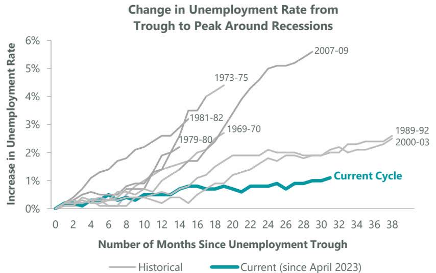
One overlooked component of the debate around an AI-induced layoff cycle, in our view, is the fact that throughout history, major technological advances have led to job creation alongside job destruction. This creative destruction process means that significant value and jobs are created by new businesses, offsetting some of the losses from the disruption of legacy firms.
Already, AI has created jobs building infrastructure (such as data centers), and we believe these opportunities will broaden in the years to come. The pace of job creation relative to destruction will be crucial in determining the path of the labor market and, by extension, the U.S. economy, but history shows that the overall effect is usually a positive one. Only 40% of today’s jobs existed 85 years ago, suggesting investors and workers alike should embrace the opportunities presented by AI.
Exhibit 7: Creative Destruction
Data as of March 18, 2026, latest available as of March 31, 2026. Source: Goldman Sachs Global Investment Research.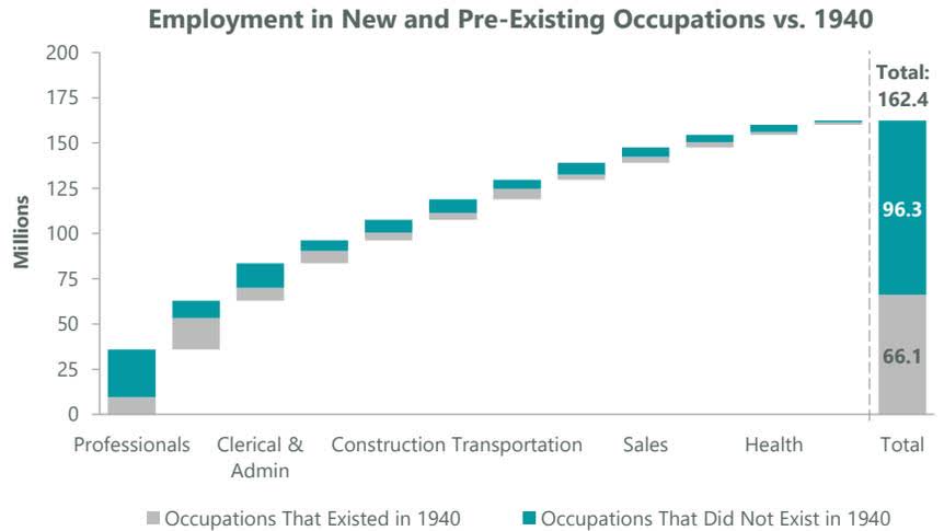
Similar fears regarding a “job apocalypse” were present during the late 1990s internet revolution. However, the economy benefited as new occupations were created in areas that were previously unimaginable, such as e-commerce, video games and content creators — yes, “influencers.” History shows that when we look back on 2026 in a decade or two, the likelihood is high that a substantial number of jobs will exist in areas we can’t even dream of today, built on the back of advances made possible by AI. Put differently, creative destruction is a feature rather than a bug of technological change and a positive force for economic growth. In fact, this very idea was awarded the Nobel Prize in economics last year.
The fourth and final brick is elevated U.S. equity market concentration. The 10 largest companies in the S&P 500 currently account for 38% of the benchmark and trade at a 5.4x multiple-point premium based on expected next-12-month earnings. Given this backdrop, passive large cap benchmarking no longer offers a broadly diversified and balanced portfolio but rather an increasingly concentrated exposure to the most richly valued part of the index.
By contrast, active managers can limit single-name exposure, rebalance into laggards and overweight compelling opportunities further down the market cap spectrum to help mitigate this concentration risk. This is important because history shows that a company’s performance profile shifts substantially after it becomes one of the 10 largest constituents in the benchmark. After strongly outpacing the index on the way up, stocks entering the top 10 have run out of steam, underperforming the benchmark by -5.8% per year over the next decade on average. As the saying goes, trees (unfortunately) don’t grow to the sky.
Exhibit 8: Trees Don’t Grow to the Sky
Data as of March 31, 2026. 1985-Present. Annualized performance relative to S&P 500. Sources: S&P, FactSet.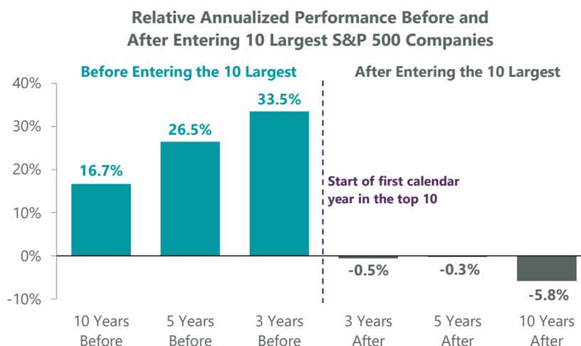
Admittedly, it is hard to imagine a world where today’s largest companies are not dominant forces over the next decade. However, a myriad of factors may alter the earnings trajectory of the current leaders as AI matures and the competitive landscape changes. The aftermath of the tech bubble may serve as a good case study, particularly as it coincides with the last period of elevated S&P 500 concentration.
The prospects of the 10 largest S&P 500 constituents at the peak of the tech bubble (March 2000) have varied widely over the subsequent 26 years. Four have had negative price returns, and only three have outperformed the benchmark. Notably, none of the 10 have outpaced the equal-weight S&P 500. While the current environment is certainly different than the dot-com era, this case study is a helpful reminder of the dynamic that may play out in the coming years. Importantly, it also illustrates the opportunity for active managers that can accurately assess the changing competitive landscape and embedded valuations of today’s leaders.
Exhibit 9: Where Are They Now: Dot-Com Darlings
*Lucent Technologies was acquired by Alcatel in 2006, cumulative price return is calculated based on the final pre-merger trading day (November 30, 2006). Note: data shown from March 2000 – present, as of March 31, 2026. Sources: FactSet, S&P.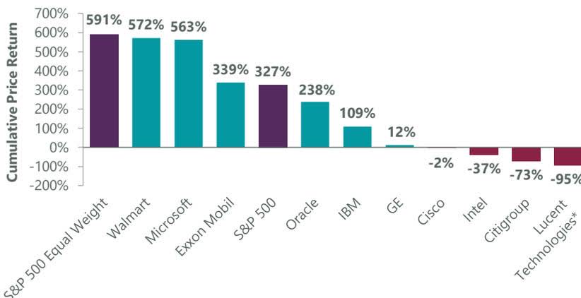
With multiple bricks making up the wall of worry today, investors can be tempted to treat each unsettling headline as the tipping point for the next crisis. Comparisons abound between higher oil and stagflation in the 1970s, and between current private credit risks and MBS ahead of the GFC, for example. However, many of these issues are more nuanced than is typically understood.
We conclude that these worries are likely forming the foundation for a renewed rally as fears subside, a typical feature of bull markets. Given our constructive economic and market outlook, we believe the market will ultimately climb today’s wall of worry as investors’ leading fears are assuaged. As a result, we view the current pullback as an opportunity to deploy capital for long-term investors.


