
So, it was another rather boring day, with the finishing flat, rates up, the up, and implied volatility somewhat higher. This has been a very odd earnings season.
Last night, I noted a rising wedge in the S&P 500, and as of yesterday’s close, the index is pretty much out of room.
There might be a little bit more time it could buy, but not much. As I mentioned yesterday, these patterns are bearish by definition.
However, just because something is bearish doesn’t mean it has to break lower.
Normally, I would have much more confidence in this pattern, but given how difficult the last four months have been for my S&P 500 views, I am quite hesitant about it.
If the pattern breaks lower, then it could retrace back to its origin at 4850. Where it goes from there, I would have to see. 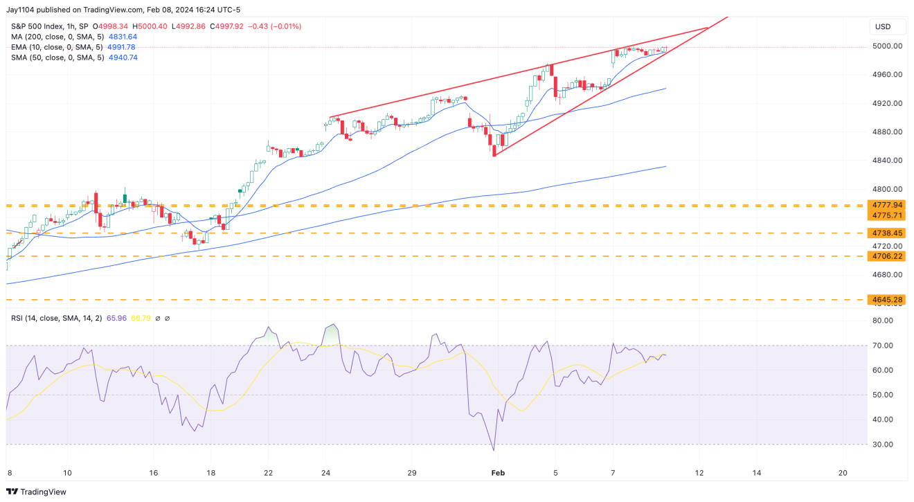
If it reaches 4,850, a lot can start to happen because I have numerous trend lines converging in that region. If these trend lines begin to break, things could start to happen.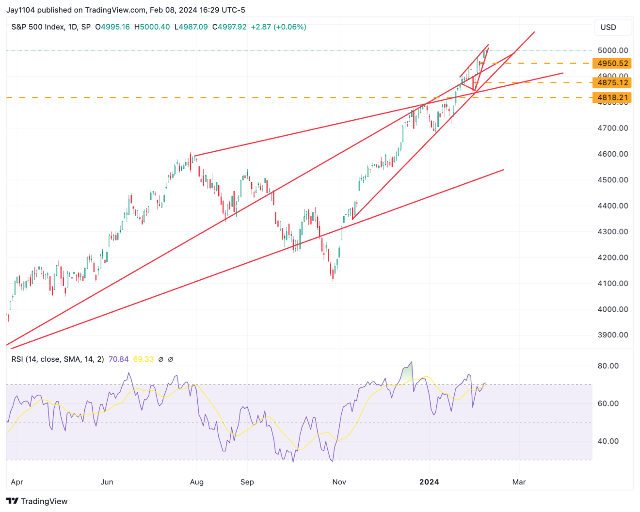
I noted earlier that implied volatility somewhat increased yesterday, and that’s because the was essentially flat, but the VVIX rose by 3% to 83, marking an increase for two consecutive days.
Sometimes, when the VVIX starts to rise, the VIX isn’t too far behind.
The VVIX measures the implied volatility of the VIX, and when the implied volatility of the VIX starts to rise, it suggests to me that something is happening beneath the surface to cause this.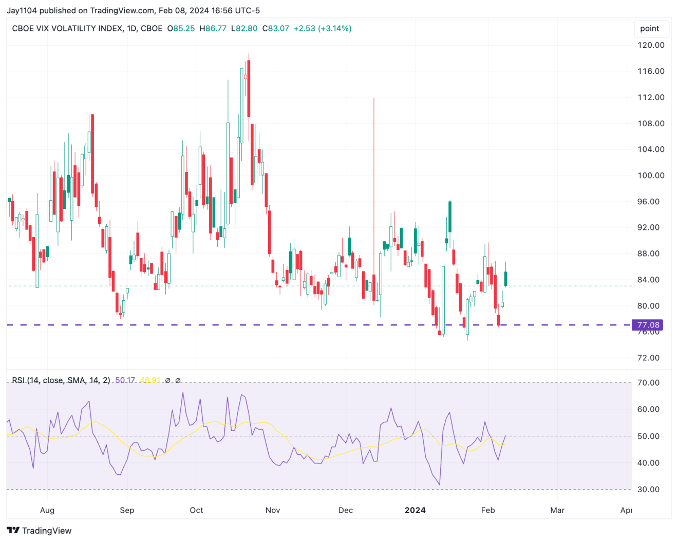
Part of the reason why we see the VIX remain below 13 to 14 is due to the significant gamma buildup around the options expiration next Wednesday, yes, February 14th.
It’s unusual to see the VIX options expiration (OPEX) occur on the second Wednesday of the month, but that’s what the calendar indicates.
I bring this up because it’s interesting to observe implied volatility levels rising from beneath, while options flows are helping to keep the VIX contained. 
Meanwhile, the auction yesterday went fine, yet we still saw the 30-year and the rates move higher.
The 10-year is very close to breaking out and rising above the 4.20% region. If that happens, I think we could see it rise to around 4.35% to start with.
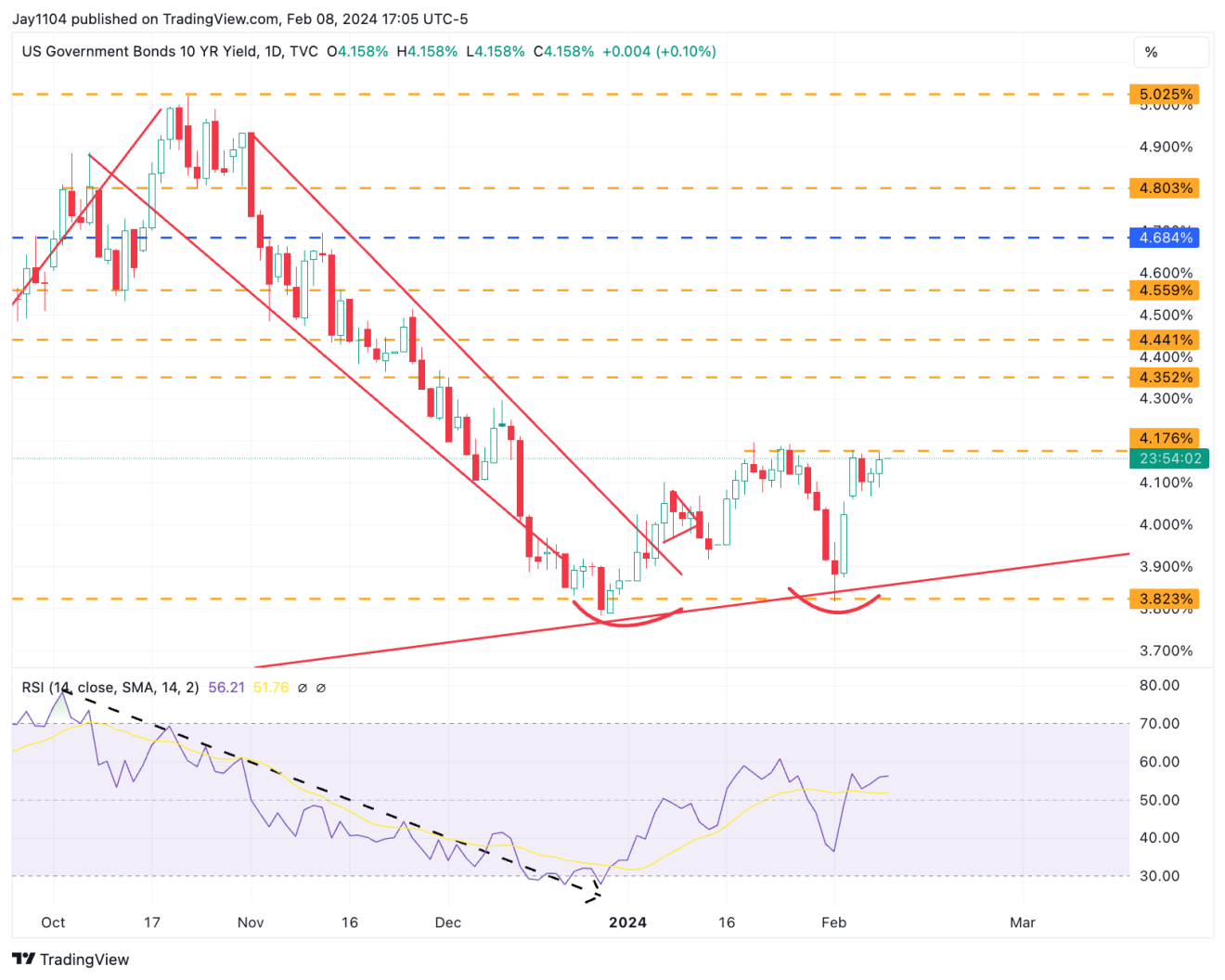
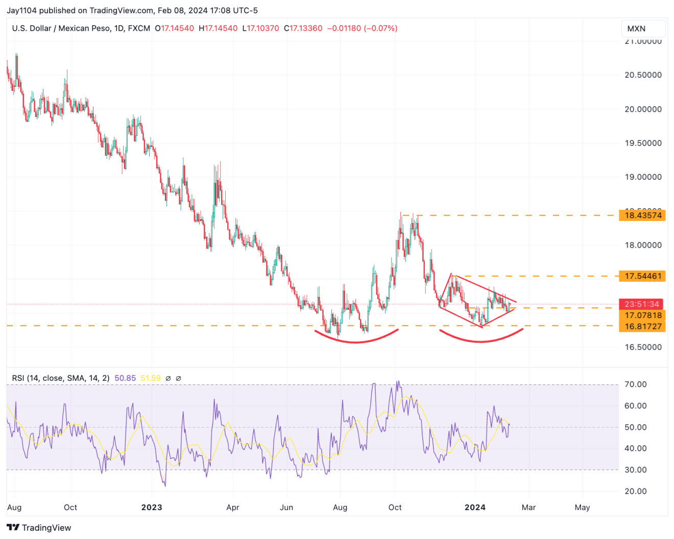
I’m also keeping an eye on the , of all things, because it looks like a double bottom is in the process of forming, mixed in with a diamond reversal pattern.
There’s solid momentum forming on the RSI, which has been pushing higher since June.
When you invert the peso, it becomes easier to see the relationship between the Peso and the S&P 500.
These relationships between the S&P 500 and currencies seem to exist widely and are a function of the dollar’s weakening and strengthening.
This emphasizes how much of the market movements have to do with changes in financial conditions. It is also evident that the S&P 500 and the peso are diverging.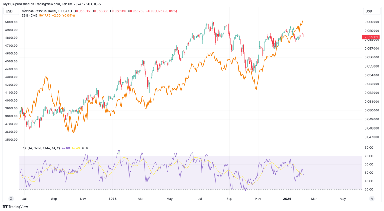
Apple (NASDAQ:) is also diverging from the S&P 500 and appears to be in a more bearish formation than the S&P 500. A close below $186 likely sets up a drop back to around $167.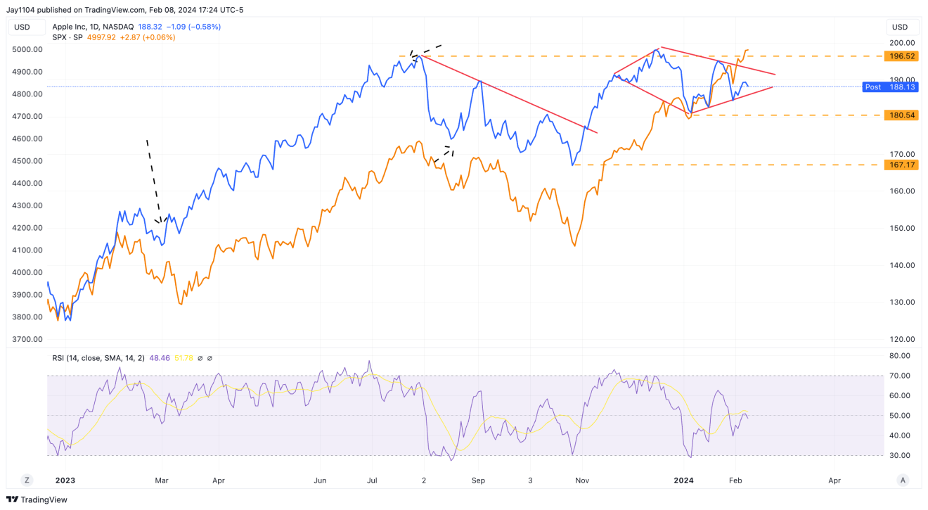
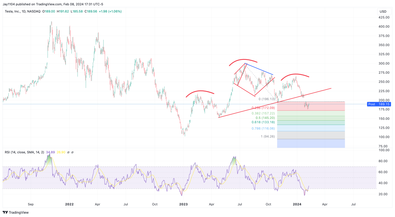
It almost looks like Tesla (NASDAQ:) has broken the neckline of a head and shoulders pattern.
It’s not clear at this point, but I can easily get the impression that if this is indeed the confirmation of the pattern, then the losses in the stock aren’t over yet.
Nvidia (NASDAQ:) exhibited a notable reversal candle yesterday, after moving above yesterday’s high and then closing below yesterday’s close.
However, given how overbought it is, and the fact that the call wall for the stock for this week and next week is at $700, there’s probably a good reason why the stock has struggled in this region over the last four days.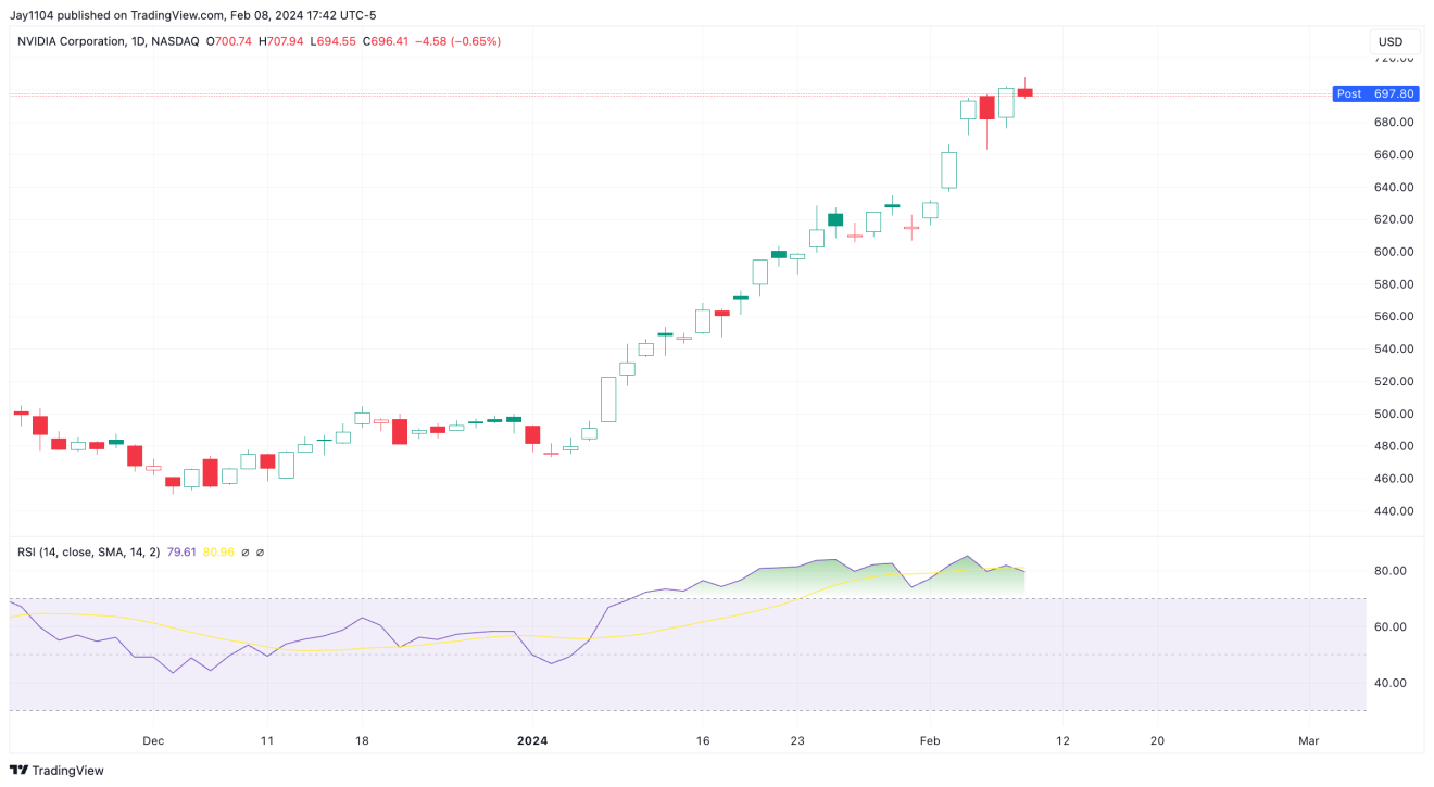
Anyway…
YouTube Video –
{{yt-JoVWO9p2kfo|}}


